

Responsive web design is an approach to web development where a single website automatically adjusts its layout, content, and visual presentation to fit any screen size — from a 27-inch desktop monitor to a 5-inch smartphone display — without requiring separate websites for different devices.
The term was coined by designer Ethan Marcotte in his landmark 2010 article published on A List Apart. His core idea was simple but revolutionary: instead of building separate websites for desktop and mobile, use flexible layouts and CSS rules to make one website respond intelligently to the device displaying it.
In 2026, responsive web design is not optional — it is the baseline standard for every website. Over 60% of global web traffic comes from mobile devices. Google uses mobile-first indexing — meaning it evaluates the mobile version of your website for ranking purposes. A website that is not responsive is simultaneously delivering a poor experience to the majority of its visitors and actively losing search rankings to competitors whose sites adapt correctly.
For Pakistani businesses building or redesigning websites — whether in Lahore, Karachi, Islamabad, or beyond — responsive web design is the non-negotiable foundation of any professional web presence. Pakistan’s mobile internet usage is among the highest in Asia, making responsive design even more critical in the local market.
This guide is part of our web design series at SiteNova Agency. For the complete context of how responsive design fits into your overall website strategy, read our guide on why website maintenance is important — responsive design requires ongoing maintenance as new devices and screen sizes emerge. If you are ready for professional responsive web design implementation, explore our SEO Services page to see how technical website excellence connects to search rankings.
Table of Contents
- What Is Responsive Web Design?
- Why Responsive Web Design Matters in 2026
- How Responsive Web Design Works — The Three Core Principles
- CSS Media Queries — The Engine of Responsive Design
- Responsive Design Breakpoints — What They Are and How to Set Them
- Fluid Grid Layouts — Building Flexible Page Structure
- Flexible Images and Media in Responsive Design
- Mobile-First Design — Why You Should Start Small
- Responsive Web Design vs Adaptive Design — Key Differences
- Responsive Web Design and SEO — Direct Impact on Rankings
- Core Web Vitals and Responsive Design
- Common Responsive Web Design Mistakes
- How to Test If Your Website Is Responsive
- Responsive Web Design for WordPress Websites
- Responsive Web Design Best Practices for 2026
- Frequently Asked Questions
- Conclusion
Why Responsive Web Design Matters in 2026
Mobile Traffic Has Overtaken Desktop
Global web traffic statistics consistently show that mobile devices account for 60 to 65% of all web browsing. In Pakistan specifically, mobile internet penetration has grown dramatically — the majority of Pakistani internet users access the web primarily or exclusively through smartphones. A website that does not respond correctly to mobile screens is delivering a broken experience to the majority of its audience.
Google’s Mobile-First Indexing
Since 2019, Google has officially used mobile-first indexing — evaluating the mobile version of your website as its primary input for search rankings. This means if your website has a full desktop version and a stripped-down or non-existent mobile version, Google ranks your site based on the inferior mobile experience.
A non-responsive website is not just a user experience problem — it is a direct SEO penalty that manifests as lower rankings across all keywords, for all users, including desktop users.
User Expectations — Responsive Is the Baseline
Users in 2026 expect websites to work correctly on any device without adjustment. A website that requires pinching to zoom, horizontal scrolling, or tiny tap targets on mobile signals an unprofessional, outdated operation. In Pakistan’s increasingly digital business environment, a non-responsive website actively damages brand credibility before a potential customer reads a single word of your content.
Conversion Rate Impact
Research consistently shows that responsive websites convert mobile visitors at significantly higher rates than non-responsive equivalents. A mobile user who must zoom in to read content, struggle with small buttons, or navigate a layout not designed for their screen will leave — and will not return. Responsive design directly protects and improves conversion rates from mobile traffic.
How Responsive Web Design Works — The Three Core Principles
Responsive web design is built on three foundational technical principles working together. Understanding these principles explains both how responsive design works and what distinguishes it from other approaches to multi-device web delivery.
Principle 1 — Fluid Grid Layouts
Traditional web design used fixed-width layouts — a container set to exactly 960 pixels wide, for example. On a 1920-pixel monitor this left white space on both sides; on a 320-pixel smartphone it extended far off-screen.
A fluid grid layout uses relative units — percentages rather than pixels — to define column widths and layout containers. A two-column layout might be defined as 60% and 40% of the container width rather than 600px and 400px. As the screen narrows, both columns shrink proportionally — maintaining their relative proportions across all screen sizes.
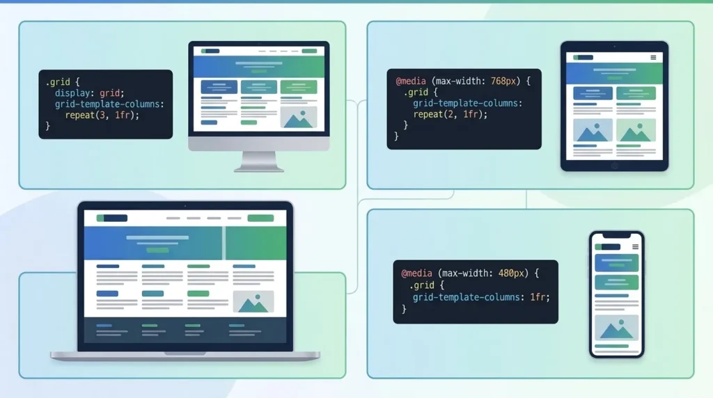
Worked Example: A three-column blog layout on desktop might use columns at 33.33% width each. At tablet width (768px), a media query switches to two columns at 50% each. At mobile width (480px), another media query stacks all content into a single 100% width column. The same HTML — three different visual presentations determined entirely by CSS.
Principle 2 — Flexible Images and Media
Images set with fixed pixel widths overflow on small screens. Flexible images scale with their container — defined with CSS as max-width: 100% — meaning they never exceed their container width but shrink proportionally when the container narrows.
This prevents the common problem of a full-width hero image appearing as a tiny partial image on mobile because its fixed pixel width exceeds the viewport.
Principle 3 — CSS Media Queries
Media queries are the mechanism that allows CSS rules to apply conditionally — based on the characteristics of the device displaying the page. The most common media query condition is screen width:
@media (max-width: 768px) {
  .column { width: 100%; }
  .nav-menu { display: none; }
  .hamburger-menu { display: block; }
}
This query applies only when the screen width is 768 pixels or less — hiding the desktop navigation and showing a mobile hamburger menu only on small screens. Desktop users see the desktop navigation; mobile users see the mobile menu. One website, one HTML file, different visual presentations.
CSS Media Queries — The Engine of Responsive Design
CSS media queries are the technical heart of responsive web design — the mechanism that allows a single stylesheet to deliver different visual presentations to different screen sizes, orientations, and device capabilities.
Media Query Syntax
A media query consists of a media type (screen, print, speech) and one or more conditions (width, height, orientation, resolution):
/* Applies when screen width is 768px or less */
@media screen and (max-width: 768px) {
  /* Mobile styles here */
}

/* Applies when screen width is between 768px and 1024px */
@media screen and (min-width: 768px) and (max-width: 1024px) {
  /* Tablet styles here */
}

/* Applies when device is in landscape orientation */
@media screen and (orientation: landscape) {
  /* Landscape styles here */
}
Max-Width vs Min-Width Approach
Max-width (desktop-first): Styles apply by default to the largest screen size; media queries reduce or modify layouts as screens get smaller. Traditional approach — starts with desktop design and strips down for mobile.
Min-width (mobile-first): Styles apply by default to the smallest screen size; media queries enhance layouts as screens get larger. Modern recommended approach — starts with mobile design and enhances for larger screens. Produces cleaner, more performant CSS because mobile styles (simpler) are the default, not overrides.
Modern CSS Without Media Queries
Modern CSS layout systems — CSS Grid and CSS Flexbox — can achieve significant responsive behavior without media queries at all:
.container {
  display: grid;
  grid-template-columns: repeat(auto-fit, minmax(300px, 1fr));
}
This CSS creates as many columns as fit at 300px minimum width — automatically flowing to fewer columns on smaller screens without a single media query. This intrinsically responsive approach is increasingly preferred for component-level layouts.
Responsive Design Breakpoints — What They Are and How to Set Them
A breakpoint is a specific screen width at which the layout changes to accommodate a different device category. Understanding breakpoints correctly is essential for responsive web design that works across all real-world devices.
Common Breakpoints in 2026
| Breakpoint | Width | Target Devices |
|---|---|---|
| Extra small | Under 480px | Small smartphones |
| Small (mobile) | 480px – 767px | Standard smartphones |
| Medium (tablet) | 768px – 1023px | Tablets, large phones |
| Large (desktop) | 1024px – 1279px | Laptops, small desktops |
| Extra large | 1280px – 1535px | Standard desktops |
| 2XL | 1536px and above | Large monitors, 4K screens |
How to Choose Breakpoints
The modern approach to breakpoints is content-driven rather than device-driven. Instead of setting breakpoints at device sizes (320px for iPhone, 768px for iPad), set breakpoints where your specific content breaks — where columns become too narrow to read comfortably, where navigation becomes crowded, where images become too small.
Worked Example: A website with a three-column service cards layout. At 1200px the three columns look excellent. At 900px the cards become too narrow. At 600px even two columns are cramped. Content-driven breakpoints: add a breakpoint at 900px (two columns) and 600px (one column) — not at generic device widths.
Tailwind CSS and Framework Breakpoints
If using a CSS framework like Tailwind CSS or Bootstrap, predefined breakpoints are provided. Tailwind’s default breakpoints: sm (640px), md (768px), lg (1024px), xl (1280px), 2xl (1536px). These cover most design needs without custom media query configuration.
Fluid Grid Layouts — Building Flexible Page Structure
A fluid grid layout is the structural foundation of a responsive website — the system that determines how page elements are arranged and how that arrangement adapts across screen widths.
CSS Grid for Responsive Layouts
CSS Grid is the most powerful layout tool for building responsive web design structures. A grid container defines the column structure; grid items fill those columns automatically.
.services-grid {
  display: grid;
  grid-template-columns: repeat(3, 1fr);
  gap: 24px;
}

@media (max-width: 768px) {
  .services-grid {
    grid-template-columns: repeat(2, 1fr);
  }
}

@media (max-width: 480px) {
  .services-grid {
    grid-template-columns: 1fr;
  }
}
Three columns on desktop, two on tablet, one on mobile — with a single CSS grid definition and two media queries.
CSS Flexbox for Component-Level Responsiveness
Flexbox excels at component-level responsiveness — navigation bars, card rows, header layouts, and any component where items should wrap or redistribute rather than follow a strict grid.
.nav-links {
  display: flex;
  flex-wrap: wrap;
  gap: 16px;
}
Navigation links wrap to the next line when the viewport is too narrow — no breakpoint required.
Relative Units — rem, em, and Percentages
Responsive typography and spacing use relative units rather than fixed pixels:
- rem: Relative to the root font size (typically 16px).
2rem = 32px. Scales with user browser font preferences — important for accessibility. - em: Relative to the parent element’s font size. Useful for component-level scaling.
- %: Percentage of the parent container width. Standard for fluid grid columns.
- vw/vh: Percentage of the viewport width or height. Useful for hero sections and full-screen elements.
Flexible Images and Media in Responsive Design
Images are among the most challenging elements to handle in responsive web design — they must scale correctly, load efficiently, and display at appropriate resolution across all screen sizes.
The Fundamental CSS Rule
img {
  max-width: 100%;
  height: auto;
}
This two-line CSS rule — applied globally — ensures images never overflow their containers and maintain their aspect ratio as they scale. It is the most impactful single CSS rule in responsive web design.
The Picture Element and Art Direction
For cases where different image crops or compositions are needed for different screen sizes — called art direction — the HTML <picture> element allows specifying different image sources for different viewport widths:
<picture>
  <source media="(max-width: 480px)" srcset="hero-mobile.webp">
  <source media="(max-width: 1024px)" srcset="hero-tablet.webp">
  <img src="hero-desktop.webp" alt="SiteNova Agency team">
</picture>
Mobile users receive a close-cropped version optimized for a narrow display; desktop users receive the full-width composition. The correct image loads based on screen size — saving bandwidth on mobile.
Responsive Images and Core Web Vitals
Unoptimized images are the primary cause of poor Core Web Vitals scores — particularly LCP (Largest Contentful Paint). For responsive design to deliver strong SEO performance, images must be:
- Compressed and in WebP format — 25 to 35% smaller than JPEG
- Correctly sized for each breakpoint — not oversized images scaled down via CSS
- Lazy loaded below the fold — loading only when needed
- The hero/above-fold image preloaded — using
<link rel="preload">to ensure it loads as early as possible
According to Google’s Web Fundamentals documentation, serving correctly sized images for each device is one of the highest-impact performance improvements available — and one of the most commonly missed in responsive web design implementations.
Responsive Video Embedding
Embedded videos (YouTube, Vimeo) require a responsive wrapper to maintain aspect ratio across screen sizes:
.video-wrapper {
  position: relative;
  padding-bottom: 56.25%; /* 16:9 ratio */
  height: 0;
}

.video-wrapper iframe {
  position: absolute;
  top: 0;
  left: 0;
  width: 100%;
  height: 100%;
}
Without this wrapper, embedded videos overflow on mobile — one of the most common responsive design failures on Pakistani business websites.
Mobile-First Design — Why You Should Start Small
Mobile-first design is the practice of designing and developing a website’s mobile layout before its desktop layout — treating mobile as the primary design target and enhancing for larger screens, rather than starting with desktop and stripping down for mobile.
Why Mobile-First Is the Right Approach
Performance: Mobile-first CSS is lighter by default — mobile styles load for all users; desktop enhancements load only for larger screens. Desktop-first CSS loads all desktop styles for mobile users and then overrides them — wasted resources.
Design clarity: Designing for the most constrained environment first forces decisions about what content is truly essential. If something is not worth showing on mobile, it probably is not worth showing at all. Mobile-first design produces leaner, more focused websites.
Google’s mobile-first indexing: Google evaluates your mobile version for rankings. A site designed mobile-first will naturally have a stronger mobile experience — the one Google uses for ranking evaluation.
Pakistani market reality: With Pakistan’s high mobile internet usage rate, designing for mobile first directly serves the majority of your actual audience.
Mobile-First Design Process
Step 1 — Design the single-column mobile layout first. Every section, every component, every navigation pattern — designed for 375px screen width. Content hierarchy becomes clear: what goes first when everything is stacked vertically?
Step 2 — Add complexity for larger screens. At tablet breakpoint, introduce two-column layouts where they improve the experience. At desktop, introduce three or four columns, wider spacing, and enhanced navigation.
Step 3 — Write CSS mobile-first. Base styles define the mobile layout; min-width media queries add desktop enhancements:
/* Mobile: full width (default) */
.card { width: 100%; }

/* Tablet: two columns */
@media (min-width: 768px) {
  .card { width: 48%; }
}

/* Desktop: three columns */
@media (min-width: 1024px) {
  .card { width: 31%; }
}
Responsive Web Design vs Adaptive Design — Key Differences
Responsive and adaptive design are both approaches to delivering appropriate experiences across devices — but they work differently and suit different situations.
| Factor | Responsive Design | Adaptive Design |
|---|---|---|
| Approach | Fluid — layout adjusts continuously | Fixed — multiple distinct layouts snap at breakpoints |
| Code structure | One codebase, one HTML | One HTML (or multiple), multiple fixed CSS layouts |
| Number of layouts | Infinite fluid states | Typically 3 to 6 fixed layouts |
| Implementation complexity | Moderate | Higher |
| Performance | Generally better on mobile | Can be optimized per device |
| Maintenance | Single codebase — easier | Multiple layouts — more maintenance |
| Best for | Most websites — standard choice | Complex web applications, performance-critical sites |
| SEO impact | Excellent — Google prefers single URL | Good — requires careful canonical handling |
Which Should You Choose?
For the vast majority of Pakistani business websites — company sites, agency websites, blogs, service businesses — responsive design is the correct choice. It is simpler to implement, simpler to maintain, and is Google’s officially recommended approach for mobile optimization.
Adaptive design is used by large-scale web applications — Amazon, booking platforms, complex dashboards — where device-specific performance optimization justifies the additional development and maintenance complexity.
Responsive Web Design and SEO — Direct Impact on Rankings
Responsive web design is not only a user experience consideration — it is a direct and significant SEO factor. Understanding the specific mechanisms through which responsive design affects search rankings helps prioritize implementation correctly.
Mobile-First Indexing — The Primary SEO Mechanism
Google’s mobile-first indexing means the mobile version of your website is what Google primarily evaluates for ranking. A non-responsive website typically shows Google either a broken mobile experience or no mobile-specific content at all — both of which produce lower rankings compared to responsive competitors.
With a properly responsive website, Google sees a single, high-quality version that works excellently on mobile — which it uses as the primary evaluation basis for all rankings.
Single URL Structure — SEO Advantage
Responsive design uses a single URL for all devices — desktop and mobile users access the same URL. This concentrates all backlink authority, social shares, and engagement signals on one URL rather than splitting them between a desktop URL and a mobile URL (as separate mobile sites do).
Google specifically recommends responsive design over separate mobile sites because the single URL structure makes link equity consolidation automatic and eliminates the duplicate content risk that separate mobile sites create.
Core Web Vitals — Responsive Design’s Performance Impact
Responsive design directly affects Core Web Vitals — Google’s performance-based ranking signals. A well-implemented responsive site:
- Delivers correctly sized images to each device — reducing LCP for mobile users
- Eliminates horizontal scrolling that creates CLS layout shifts
- Reduces page weight for mobile users — improving overall speed
- Maintains touch-friendly tap targets — reducing INP interaction delays
For a complete technical SEO foundation that works with responsive design, our technical SEO checklist covers every Core Web Vitals optimization step in detail.
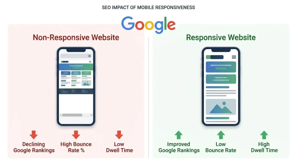
Bounce Rate and Dwell Time — Indirect SEO Signals
Non-responsive websites generate high bounce rates from mobile users who immediately leave due to poor usability. High bounce rates and short dwell time signal to Google that your page did not satisfy the user’s needs — a negative ranking signal. Responsive design, by delivering a usable mobile experience, directly improves these behavioral metrics and the indirect SEO benefits they carry.
Core Web Vitals and Responsive Design
Core Web Vitals — Google’s specific performance metrics — are directly influenced by responsive design decisions. Understanding the connection between responsive design choices and Core Web Vitals scores helps prioritize implementation correctly.
LCP (Largest Contentful Paint) and Responsive Design
LCP measures how quickly the largest visible element — usually the hero image — loads on the page. Responsive design affects LCP through:
Image sizing: A desktop hero image might be 1920×1080px — 400KB or more. Serving this image to a 375px mobile screen is wasteful and slow. Using responsive images with the <picture> element or srcset delivers a 375px-wide image to mobile users — dramatically faster LCP.
Preloading the LCP image: The hero image should be preloaded using <link rel="preload"> — ensuring it begins loading immediately rather than after CSS is parsed. Combined with responsive image sizing, this typically reduces mobile LCP by 1 to 2 seconds.
CLS (Cumulative Layout Shift) and Responsive Design
CLS measures visual stability — how much elements shift as the page loads. Responsive design causes CLS when:
Images without explicit dimensions: Images without width and height attributes cause layout shift when they load — the browser does not know how much space to reserve until the image downloads. Always specify image dimensions in HTML, even for responsive images.
Late-loading content: Content injected into the page after initial load — ads, cookie banners, dynamic content — that pushes existing content downward causes CLS. Responsive design should reserve space for these elements.
INP (Interaction to Next Paint) and Responsive Design
INP measures how quickly the page responds to user interactions. Responsive design affects INP through:
Touch targets: Tap targets (buttons, links) that are too small force users to retry taps — each retry is an interaction. Touch targets should be minimum 48×48 pixels with adequate spacing. This is a responsive design consideration — desktop hover interactions can be smaller, mobile tap targets must be larger.
Common Responsive Web Design Mistakes
Even experienced developers make these responsive design mistakes that damage both user experience and SEO rankings.
Fixed-Width Elements That Overflow
Setting any element to a fixed pixel width wider than the mobile viewport creates horizontal scrolling — one of the most damaging mobile UX failures. Common culprits: tables with fixed column widths, images without max-width: 100%, embedded iframes without responsive wrappers.
Fix: Audit every element with a fixed width. Replace fixed pixel widths with percentage widths, max-width constraints, or CSS Grid/Flexbox layouts.
Unreadable Font Sizes on Mobile
Text that looks perfectly sized on desktop at 14px becomes unreadably small on a 375px mobile screen. Minimum readable body text on mobile: 16px. Heading sizes should scale proportionally — CSS clamp() function creates fluid typography that scales smoothly between minimum and maximum sizes:
h1 { font-size: clamp(1.5rem, 4vw, 3rem); }
Touch Targets Too Small
Buttons, links, and interactive elements that work with a mouse cursor become frustrating with a fingertip. Google’s mobile usability standards require touch targets of minimum 48×48 pixels. Placing links too close together causes accidental taps on the wrong element — a major mobile UX failure.
Hiding Important Content on Mobile
A common but misguided responsive approach is hiding large sections of content on mobile using display: none — removing content to simplify the mobile layout. This is problematic for two reasons: users on mobile miss the hidden content, and Google’s mobile-first indexing evaluates the mobile version — hidden content contributes nothing to rankings.
The correct approach is reorganizing content for mobile — stacking, collapsing, or accordion-expanding — not removing it.
No Viewport Meta Tag
Forgetting to include the viewport meta tag — <meta name="viewport" content="width=device-width, initial-scale=1"> — causes the browser to render the page at desktop width and scale it down, making everything tiny. This single missing line is the most common cause of a responsive website appearing broken on mobile.
Testing Only on Desktop Browser Simulation
Browser developer tools mobile simulation is not equivalent to testing on real devices. Real device testing reveals issues invisible in simulation: actual touch behavior, actual network speed, actual rendering performance. Test on real Android and iOS devices — both the most popular and the oldest devices your audience uses.
How to Test If Your Website Is Responsive
Google’s Mobile-Friendly Test
Google provides a free Mobile-Friendly Test tool that checks whether a specific URL meets Google’s mobile usability requirements. Enter your URL and Google analyzes the page and reports specific issues: text too small, tap targets too close, content wider than screen.
This test is the definitive authority on whether Google considers your page mobile-friendly — because it uses the same evaluation criteria as Google’s search ranking assessment.
Google Search Console Mobile Usability Report
Google Search Console’s Core Web Vitals report and Mobile Usability report show mobile issues across your entire website — not just individual pages. Check this report monthly to catch new mobile issues introduced by content updates or plugin changes.
Browser Developer Tools
Every major browser (Chrome, Firefox, Safari) includes developer tools with device simulation. Press F12 in Chrome, click the device toggle icon, and select different device presets (iPhone SE, Samsung Galaxy, iPad) to preview your website at different screen sizes.
Useful for development and debugging but not a substitute for real device testing.
Real Device Testing
Test your website on actual physical devices — minimum one Android smartphone, one iPhone, and one tablet. Check:
- Can all text be read without zooming?
- Do all buttons and links work with finger taps?
- Does no content extend off-screen?
- Does the navigation open and close correctly?
- Do all forms function and submit correctly?
- Does the page load in under 3 seconds on a 4G connection?
Responsive Web Design for WordPress Websites
Since the majority of Pakistani business websites run on WordPress, understanding responsive design specifically in the WordPress context is practical and directly applicable.
Responsive WordPress Themes
Modern WordPress themes are built responsive by default — but not all themes implement responsive design with equal quality. When selecting a WordPress theme for responsiveness, evaluate:
- Does the theme pass Google’s Mobile-Friendly Test?
- Does the demo site display correctly on a real smartphone?
- Does the theme use CSS Grid or Flexbox for layout (modern) or floats (outdated)?
- Are Core Web Vitals scores acceptable in the theme demo — especially mobile LCP?
Avoid themes with excessive animations, large JavaScript libraries, or complex visual effects — these typically produce poor mobile performance regardless of their visual appeal on desktop.
Elementor and Responsive Design
Elementor — the most popular WordPress page builder — includes built-in responsive editing. In Elementor’s editor, switch to tablet or mobile view to see and edit how each section appears on smaller screens. Each layout property (column widths, margins, padding, font sizes) can be set independently for desktop, tablet, and mobile.
Common responsive Elementor settings to configure:
- Column stack order on mobile (which column appears first when stacked)
- Font size adjustments for mobile readability
- Padding reduction on mobile (desktop padding is often too large on mobile)
- Navigation menu responsive behavior
- Image size adjustments per breakpoint
Image Optimization Plugins for WordPress
Responsive design delivers layout responsiveness — but image optimization requires additional plugins:
- ShortPixel or Imagify: Compress images and convert to WebP on upload
- Lazy Load by WP Rocket: Defer below-fold images
- Smush: Detect and resize images served at incorrect dimensions
Responsive Web Design Best Practices for 2026
Design for Touch First
With the majority of web browsing happening on touchscreens, design every interactive element for touch interaction as the primary mode — not mouse hover. Hover states are invisible on touchscreens; click/tap states must convey all the visual feedback a user needs.
Use System Fonts or Variable Fonts
Web font loading — particularly multiple font weights loaded from external CDNs — is a common performance bottleneck that damages mobile LCP scores. In 2026, using system font stacks (iOS San Francisco, Android Roboto) for body text provides near-zero load time while maintaining readability. For brand fonts, use variable fonts (single file with multiple weights) and preload them.
Implement Logical Properties for International Sites
If your website serves multiple languages or right-to-left (RTL) scripts, use CSS logical properties — margin-inline-start instead of margin-left, padding-block-end instead of padding-bottom — which adapt automatically to text direction without duplicate CSS.
Progressive Enhancement
Build the core content and functionality first — accessible without JavaScript, without custom fonts, without complex CSS. Then enhance progressively for capable browsers and devices. This approach ensures the most basic mobile devices always see functional content, even if they cannot render all enhancements.
Reduce Motion for Accessibility
CSS animations and transitions that work well on desktop can cause nausea for users with vestibular disorders. Implement prefers-reduced-motion media queries to disable or reduce animations for users who have requested this in their device settings:
@media (prefers-reduced-motion: reduce) {
  * { animation: none; transition: none; }
}
Regular Responsive Audits
New devices, new browser versions, and new content added to your website can all introduce responsive design regressions. Schedule quarterly responsive audits — testing on current device models, checking Google Search Console for new mobile usability issues, and verifying Core Web Vitals scores remain in acceptable ranges. Our website maintenance guide covers the complete maintenance schedule that keeps responsive design working correctly over time.
Frequently Asked Questions About Responsive Web Design
Q: What is responsive web design in simple terms?
Responsive web design is a website that automatically adjusts its layout and content to look and work correctly on any screen size — from a large desktop monitor to a small smartphone. A responsive website uses CSS media queries and flexible layouts so that the same page displays as a multi-column layout on desktop and a single-column layout on mobile, without requiring separate websites for each device.
Q: Why is responsive web design important for SEO?
Responsive web design is critical for SEO because Google uses mobile-first indexing — ranking websites primarily based on how they perform on mobile devices. A non-responsive website delivers a poor mobile experience that Google penalizes with lower rankings. Responsive design also improves Core Web Vitals scores (LCP, CLS, INP), reduces bounce rates from mobile users, and consolidates all SEO value on a single URL. For the complete picture of how technical website health affects rankings, our technical SEO checklist covers every factor in detail.
Q: What is the difference between responsive and mobile-friendly?
Mobile-friendly is a broader term — it means a website works adequately on mobile. Responsive web design is a specific technical approach to achieving mobile-friendliness through fluid layouts, flexible images, and CSS media queries. A website can be mobile-friendly through other approaches (separate mobile site, adaptive design) but responsive design is the most common, Google-recommended method for achieving mobile-friendliness.
Q: What are CSS media queries and how do they work?
CSS media queries are CSS rules that apply conditionally based on device characteristics — most commonly screen width. A media query like @media (max-width: 768px) applies the styles inside only when the screen is 768 pixels wide or less. This allows a single stylesheet to define different layouts for desktop, tablet, and mobile — switching column widths, font sizes, navigation patterns, and any other CSS property based on the screen size displaying the page.
Q: How do I know if my website is responsive?
The quickest test: visit your website on a smartphone and check whether you can read the text without zooming, whether you need to scroll horizontally, and whether all buttons are tappable with a fingertip. For a more definitive test, use Google’s free Mobile-Friendly Test tool which evaluates your page against Google’s official mobile usability criteria and reports specific issues. Google Search Console’s Mobile Usability report shows responsive issues across your entire website.
Q: Does responsive design affect website loading speed?
Responsive design itself does not slow websites down — but how it is implemented affects speed. A well-implemented responsive website with correctly sized images, minimal JavaScript, and efficient CSS delivers excellent mobile performance. A poorly implemented responsive site that loads desktop-sized images and large JavaScript libraries on mobile delivers slow performance. The responsive design approach is neutral — implementation quality determines speed. Use Google’s PageSpeed Insights to measure current performance and identify specific improvements.
Conclusion — Responsive Web Design Is the Foundation of Every Modern Website
Responsive web design is not a feature to add to a website — it is the fundamental approach to building websites in 2026. With the majority of web traffic on mobile, Google’s mobile-first indexing determining search rankings, and user expectations firmly set at seamless cross-device performance, a non-responsive website is not a website that is missing a feature. It is a website that is failing most of its visitors and most of its SEO potential simultaneously.
For Pakistani businesses — where mobile internet usage is exceptionally high and competition for organic search visibility is intensifying — a responsive website is the non-negotiable starting point for any digital marketing investment. Every other SEO effort, every piece of content marketing, every Google Ads campaign sends traffic to your website. If that website fails on mobile, every upstream marketing investment is diminished.
Building correctly — with fluid grid layouts, CSS media queries, flexible images, and a mobile-first approach — produces a website that works for every visitor, ranks for every user on Google, and converts across every device. It is the most important technical investment any Pakistani business can make in its digital presence.
At SiteNova Agency, responsive web design is the starting point of every website we build and every website we optimize for clients across Lahore, Karachi, Islamabad, and beyond. Our team ensures every website delivers excellent performance across all devices — supporting both the user experience and the search rankings that grow your business. Explore our services to see how professional web design and SEO work together to build digital presence that performs.