
eCommerce website design is the process of planning, structuring, and building an online store that enables customers to browse products, make purchasing decisions, and complete transactions — across any device, at any time, without friction.
It is not simply making a website look attractive. eCommerce design is a discipline that combines visual design, user experience engineering, conversion rate optimization, technical performance, and search engine visibility into a single digital system whose primary purpose is generating revenue.
The distinction matters because most eCommerce websites in Pakistan and globally fail not because they look bad — but because they are built around aesthetics rather than customer behavior. A visually impressive online store with slow load times, a confusing checkout, or poor mobile experience will consistently underperform a simpler store designed around how customers actually shop.
This guide covers every dimension of eCommerce website design — from platform selection and homepage structure through product page layout, checkout optimization, mobile performance, SEO, and trust signals. Whether you are building your first online store or redesigning an existing one, the principles here apply directly.
For the technical SEO and website maintenance foundations that keep an eCommerce site performing after launch, our guides on technical SEO checklist and why website maintenance is important cover the ongoing requirements in detail. And if you are starting from a redesign rather than a new build, the website redesign guide explains how to protect your existing SEO equity through the transition.
Table of Contents
- What Is eCommerce Website Design?
- Why eCommerce Website Design Directly Affects Revenue
- Choosing the Right Platform for Your eCommerce Website
- eCommerce Website Design — Homepage Structure
- Product Category and Collection Page Design
- Product Page Design — The Revenue-Critical Page
- Shopping Cart and Checkout Design
- Mobile Commerce — Designing for Smartphone Shoppers
- eCommerce Website Speed and Core Web Vitals
- Trust Signals and Security in eCommerce Design
- SEO for eCommerce Website Design
- Navigation and Site Architecture for Online Stores
- Search Functionality and Product Filtering
- eCommerce Photography and Visual Content
- Payment Gateway Integration and Design Considerations
- eCommerce Website Design Costs in Pakistan
- Common eCommerce Website Design Mistakes
- Frequently Asked Questions
- Conclusion
Why eCommerce Website Design Directly Affects Revenue
Every design decision in an online store — the placement of the add-to-cart button, the number of fields in the checkout form, the speed at which product images load — directly influences whether a visitor becomes a customer.
This is not theoretical. Research from the Baymard Institute, which has conducted the most comprehensive usability research on eCommerce checkout flows, consistently shows that the average cart abandonment rate across eCommerce websites is approximately 70%. Most of that abandonment is not because customers changed their minds — it is because the design created friction, confusion, or distrust at the moment of decision.
Poor eCommerce website design produces measurable revenue loss in specific, identifiable ways. A one-second delay in page load time reduces conversions by 7%. A checkout that requires account creation before purchase loses 24% of customers at that step alone. Product pages without sufficient photography drive customers to competitors who show what they are actually buying.
Understanding these mechanisms changes how you approach eCommerce design — from a creative exercise to a revenue engineering problem where every element has a measurable business impact.
Choosing the Right Platform for Your eCommerce Website
The platform decision is the most consequential technical choice in eCommerce website design — it determines what you can build, how fast you can build it, what it costs to maintain, and what limitations you will live with for years.
Shopify
Shopify is the dominant hosted eCommerce platform globally, and for good reason. The infrastructure — hosting, security, payment processing, updates — is managed entirely by Shopify. You focus on design and products.
Shopify is the right choice when you want to launch quickly, your team does not have developer resources for ongoing maintenance, and your product catalog is standard (physical products, standard variants, straightforward shipping). Shopify’s theme ecosystem and app store mean most functionality can be added without custom development.
Limitations: Shopify charges a transaction fee on every sale unless you use Shopify Payments (not available in Pakistan as of 2026). Monthly subscription costs range from $39 to $399 for standard plans. Deep custom functionality requires developer expertise in Liquid (Shopify’s templating language), which is less common than PHP/WordPress expertise in Pakistan’s developer market.
WooCommerce
WooCommerce is a WordPress plugin that transforms a WordPress website into a fully functional eCommerce store. It is open source, free to install, and the most customizable eCommerce solution available — which is precisely why most Pakistani businesses building serious online stores choose it.
WooCommerce is the right choice when you need deep customization, when you already have a WordPress website, when you want full control over your data and hosting, or when your product catalog has complex requirements (custom product types, wholesale pricing, B2B functionality, custom checkout flows).
The trade-off is maintenance responsibility — you manage hosting, security updates, plugin compatibility, and backups. For businesses without in-house technical resources, this requires a professional agency relationship for ongoing support.
Magento (Adobe Commerce)
Magento is enterprise-level eCommerce — built for large catalogs (thousands of SKUs), complex B2B workflows, multi-store configurations, and high-volume operations. It is the correct choice for established businesses with significant technical teams and budgets.
For most Pakistani SME and startup eCommerce projects, Magento is significantly over-engineered. The implementation cost and ongoing development requirements make it impractical unless the business justifies the investment.
Platform Selection by Business Type
| Business Type | Recommended Platform | Reason |
|---|---|---|
| First online store, fast launch | Shopify | Managed hosting, quick setup |
| WordPress existing site | WooCommerce | Familiar ecosystem, deep control |
| Complex catalog, custom needs | WooCommerce (custom) | Full flexibility |
| Large B2B or enterprise | Magento | Scale and complexity handling |
| Very large, custom requirements | Custom development | When no platform fits |
eCommerce Website Design — Homepage Structure
The homepage of an online store serves a different purpose than the homepage of a service business website. It is not primarily an introduction to the company — it is a navigation and trust gateway that directs visitors to the products they want as efficiently as possible.
Most visitors to an eCommerce homepage arrive without a specific product in mind. They are browsing, evaluating whether the store carries what they need, and forming an impression of whether the store is trustworthy enough to buy from. The homepage design must accomplish three things in the first five seconds: communicate what the store sells, signal credibility and trust, and provide clear paths to product discovery.
Above the Fold — The First Screen
The content visible before scrolling — the above-the-fold area — must communicate the store’s value proposition immediately. The typical high-performing eCommerce homepage above-the-fold section contains:
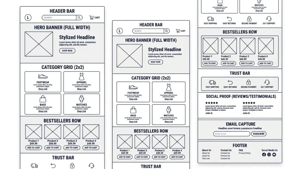
A prominent header with the store logo on the left, a full-width search bar in the center (for larger catalogs), and a shopping cart icon with item count on the right. Below the header: a hero banner featuring your strongest current offer, bestselling product category, or seasonal campaign — with a single, clear call-to-action button (“Shop Now,” “Explore Collection,” “See New Arrivals”).
The hero banner is not decoration. It is the primary driver of where first-time visitors navigate. Test different hero messages and products systematically — the difference between a weak hero and a strong one can be 20 to 40% in click-through rate to product pages.
Below-the-Fold Homepage Sections
After the hero, the homepage should flow through these sections in order:
Featured categories or collection grid — visual navigation tiles for your main product categories. This serves customers who know what category they want but have not yet identified a specific product.
Bestsellers or featured products — your highest-converting products surfaced directly on the homepage. Customers who see a product they want on the homepage convert at significantly higher rates than those who navigate to find it.
Trust bar — a horizontal strip of trust signals: free shipping threshold, return policy, secure payment icons, customer support availability. This section addresses the most common barriers to first-time purchase without requiring the customer to navigate to a separate page.
Social proof — customer reviews summary, Instagram feed integration if relevant, or a short testimonial strip. New customers assess unfamiliar stores primarily through social proof; surfacing it on the homepage reduces abandonment.
Secondary featured category or promotional banner — a secondary offer or category highlight for customers who did not engage with the primary hero.
Email capture — a newsletter signup with a clear incentive (first-order discount, exclusive offers) positioned near the footer. Email marketing ROI for eCommerce consistently outperforms every other channel; building the list from day one is a design priority.
Product Category and Collection Page Design
Product category pages are the navigational backbone of an eCommerce website. They sit between the homepage and the product pages — helping customers narrow from a broad category to the specific product they want. Category page design has a direct impact on both conversion rate and SEO.
Grid Layout and Product Card Design
Category pages display products in a grid — typically two to four columns on desktop, one to two on mobile. The product card — the repeating unit in the grid — must communicate enough information for a customer to decide whether to click through:
Product image: The primary driver of click-through from category pages. Consistent image style (same background, same angle, same cropping) across all products in a category creates a professional appearance that builds trust. Variable image styles — some on white, some lifestyle, some at different scales — make the category page look disorganized.
Product name: Clear, descriptive, and ideally includes the key product attribute (size, color, material, model) that distinguishes variants.
Price: Visible without hovering. Customers scan price in the category view — hiding it until product page click-through increases friction.
Stock status: “In Stock,” “Low Stock,” or “Out of Stock” labels on category cards prevent the frustration of clicking through to a product only to discover it is unavailable.
Quick-add to cart: A subtle add-to-cart button visible on hover (desktop) or as a persistent button (mobile) allows customers to add clear-choice products without navigating away from the category.
Faceted Navigation and Product Filtering
For stores with more than twenty products in a single category, filtering is essential. Customers shopping for shoes need to filter by size, color, and price. Customers shopping for electronics need to filter by brand, specifications, and price range.
Faceted navigation — filter menus on the left side (desktop) or in a slide-out panel (mobile) — allows customers to narrow results without leaving the category page. Every applied filter should update the URL (for shareability and bookmarking) and should not trigger a full page reload — AJAX filtering maintains customer position in the page while updating results.
The critical SEO consideration: faceted navigation generates enormous numbers of URL combinations that can produce duplicate or thin content issues. Managing faceted navigation correctly for eCommerce SEO requires careful canonical tag implementation and robots.txt configuration — an area where professional eCommerce development makes a significant difference. Our technical SEO checklist covers canonical tag implementation for faceted navigation in detail.
Product Page Design — The Revenue-Critical Page
The product page is where purchasing decisions are made. Every other page in the eCommerce website exists to deliver qualified, interested customers to the product page. What happens there determines whether those customers buy.
Product page design is the highest-leverage design decision in eCommerce — small improvements in product page conversion rate have an immediate, compounding effect on revenue. A product page converting at 3% versus 2% on 10,000 monthly visitors represents 100 additional sales per month.
Product Photography — The Primary Conversion Driver
More purchasing decisions are made or abandoned based on photography than on any other product page element. Customers who cannot see what they are buying — in sufficient detail, from multiple angles, and in use context — will not buy. This is not a preference; it is a documented behavioral pattern.
Every product page should include a minimum of four to six images: front view, side view, back view, detail shot (material, texture, construction), scale reference (product alongside a familiar object or worn/used by a person), and at least one lifestyle or in-use image that shows the product in context.
Image zoom functionality — allowing customers to inspect detail at high magnification — is standard on well-designed product pages and has a measurable positive impact on conversion, particularly for clothing, accessories, and technical products.
The Add-to-Cart Zone
The area of the product page containing the primary action — add to cart — is the most studied and most optimized section in eCommerce design. Every element in this zone affects conversion:
Product name in H1: Clear, descriptive, matching what the customer searched for.
Price: Prominent, with sale price and original price both displayed when on promotion. Avoid burying the price below the fold or making it hard to find — price visibility reduces abandonment.
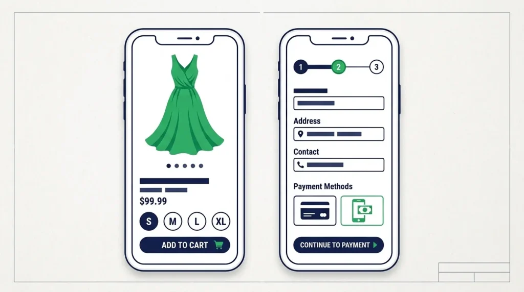
Variant selection: Size, color, material, and other variants should be displayed as visual swatches (for color/pattern) or buttons (for size/specification) — not dropdown menus, which hide options and require extra interaction. Selecting a variant should update the product image to show that variant.
Quantity selector: Minimal. A simple plus/minus counter is sufficient. Do not add friction here.
Add-to-cart button: Large, high-contrast, and always visible in the primary viewport on mobile — never buried below reviews or description. The button label should be action-specific (“Add to Bag,” “Add to Cart”) rather than generic (“Submit” or “Continue”).
Delivery information: “Order within 3 hours for same-day dispatch” or “Free delivery over Rs. 2,000” directly in the add-to-cart zone — not buried in the description or footer — is a conversion driver that reduces the most common reason for abandonment: uncertainty about shipping.
Product Description and Specifications
Product descriptions serve dual purposes: they inform the customer’s purchase decision and they provide the keyword-rich, structured content that Google uses to rank product pages in organic search.
Descriptions should be scannable — bullet points for key features and specifications, followed by a more detailed paragraph for context and use cases if the product warrants it. Avoid manufacturer-provided descriptions without rewriting them — duplicate content from manufacturer specs weakens eCommerce SEO significantly.
Specification tables — organized in an HTML table with clear attribute-value pairs — are both the most readable format for technical products and the most crawlable format for search engines. They also qualify for product schema markup that can display rich results in Google.
Customer Reviews
Customer reviews on product pages increase conversion rate. The effect is well-documented and consistent across product categories — new customers trust peer reviews more than brand messaging. A product with 15 reviews converting at 4% will typically outperform an identical product with no reviews converting at 2.5%.
Display reviews in a structured format below the product description — star rating summary at the top (average rating + total count), individual reviews below with date, verified purchase badge, and reviewer name. Enable review filtering by rating so customers can read both positive and critical reviews.
Review schema markup — implemented through your eCommerce platform or a dedicated review plugin — allows star ratings to appear in Google search results as rich snippets, improving click-through rate from organic search.
Shopping Cart and Checkout Design
Cart abandonment at 70% is not a customer loyalty problem — it is a design problem. Customers who add products to a cart are declaring intent to purchase. The checkout flow either fulfills that intent or creates barriers that defeat it.
Cart Page Design
The cart page serves a transitional function — it confirms what the customer intends to buy and presents the final opportunity to adjust the order before committing to payment. Cart design should accomplish this cleanly:
Product summary: Image thumbnail, product name, selected variant, quantity adjuster, and unit price — all on one line per product.
Order summary: Subtotal, shipping estimate, applicable discounts, and total — clearly visible, updated in real time when quantities change.
Upsell and cross-sell: “You might also like” or “Complete the look” recommendations below the cart — presenting related products at the moment of highest purchase intent. This is the highest-converting location for product recommendations in the entire eCommerce flow.
Proceed to checkout: A single, prominent call-to-action button. Do not clutter the cart page with secondary actions that compete with this button.
Trust reinforcement: Security badges, return policy reminder, and customer support contact near the checkout button — addressing the final hesitations before commitment.
Checkout Flow Design
The checkout is the most studied and most abandonment-prone section of any eCommerce website. The Baymard Institute’s research — the most comprehensive published analysis of checkout usability — identifies these as the most critical design requirements for checkout conversion:
Allow guest checkout. Requiring account creation before purchase is the single highest-impact abandonment trigger in eCommerce checkout design. Offer account creation after purchase as a convenience, not as a gate before it.
Minimize form fields. Every additional field in the checkout reduces conversion. Request only what you need to complete the transaction — name, shipping address, and payment information. Do not ask for date of birth, phone number format preferences, or information that does not serve the transaction.
Show progress. A multi-step checkout (Contact → Shipping → Payment → Review) should show a progress indicator so customers know exactly where they are and how many steps remain.
Display order summary persistently. On desktop, the order summary should be visible alongside the form — not accessible only via an accordion collapse. Customers abandon when they lose sight of what they ordered.
Explain errors immediately. Inline validation — flagging form errors as the customer types rather than only on submission — reduces frustration and abandonment from multiple failed submission attempts.
Multiple payment methods. In Pakistan’s eCommerce market, customers expect to see JazzCash, EasyPaisa, and bank transfer options alongside card payment. The absence of familiar local payment methods is a significant abandonment driver for Pakistani eCommerce stores.
Mobile Commerce — Designing for Smartphone Shoppers
In Pakistan, the majority of eCommerce browsing and a growing proportion of transactions happen on mobile devices. Designing for mobile is not an enhancement to your eCommerce website — it is the primary design requirement.
Mobile eCommerce design is not desktop design shrunk to fit a small screen. It is a fundamentally different interaction model — touch instead of click, vertical scroll instead of horizontal scan, interrupted sessions instead of focused browsing, and slow connections instead of reliable broadband. Check that is your website is mobile friendly or not. Google Mobile-Friendly Test
Touch-First Interaction Design
Every interactive element on a mobile eCommerce page must be designed for finger navigation. The minimum tap target size recommended by Google’s mobile usability guidelines is 48 × 48 pixels. Product grid items, filter buttons, quantity selectors, and the add-to-cart button must all meet this minimum — anything smaller creates frustration and misclicks.
Swipe navigation for product image galleries replaces the click-based thumbnail navigation of desktop. Mobile customers expect to swipe through product images — a gallery that requires tapping small arrow buttons is a friction point.
Mobile Navigation for eCommerce
Desktop navigation — a horizontal menu bar with category dropdowns — does not translate to mobile. Mobile eCommerce navigation uses a hamburger menu (three horizontal lines) that opens a full-height slide-out panel containing the complete category structure.
The slide-out navigation panel should be organized as a vertical list of primary categories, expandable to show subcategories with a tap. For stores with large category trees, a two-level navigation (category then subcategory) is more usable than deeply nested menus that require multiple taps to reach products.
A persistent search icon in the mobile header — opening a full-screen search experience when tapped — is essential for catalog-heavy stores where navigation browsing is less efficient than direct search.
Mobile Checkout Optimization
Mobile checkout has a lower completion rate than desktop checkout on most eCommerce websites — not because mobile customers are less committed, but because most checkout forms are not optimized for mobile keyboard entry.
Implement input type attributes correctly — type="email" shows the email keyboard, type="tel" shows the numeric pad for phone number entry, type="number" for quantities. These single HTML attribute changes eliminate the frustration of customers typing a numeric card number on an alphabetic keyboard.
Enable autofill. Modern mobile browsers can autofill name, address, and payment information from saved customer data — but only if the form fields are correctly labeled and the autocomplete attributes are properly set. A checkout that disables autofill adds minutes of typing to a process that should take seconds.
Apple Pay, Google Pay, and local digital wallets (JazzCash, EasyPaisa) complete mobile transactions with a single biometric confirmation — eliminating the most friction-heavy part of mobile checkout entirely. Any Pakistani eCommerce store targeting mobile customers should prioritize these payment methods.
eCommerce Website Speed and Core Web Vitals
Page speed is a direct revenue variable in eCommerce — not merely a technical metric. The relationship between load time and conversion rate is one of the most thoroughly documented findings in web analytics: slower pages sell less, regardless of design quality or product appeal.
Google’s Core Web Vitals — LCP (Largest Contentful Paint), INP (Interaction to Next Paint), and CLS (Cumulative Layout Shift) — are both direct ranking factors and meaningful proxies for the user experience that drives eCommerce conversion. A product page with an LCP above 4 seconds is losing customers to faster competitors and losing rankings to better-optimized eCommerce sites simultaneously.
Speed Optimization Specific to eCommerce
eCommerce websites have specific speed challenges that general websites do not share.
Product image optimization: An eCommerce store with 500 products could have 2,000 to 3,000 product images. Uncompressed, these add enormous page weight. Every product image should be compressed (WebP format, 80 to 90% quality setting) and served at the correct display size — not full-resolution images scaled down by CSS. An image optimization plugin or CDN with image transformation (Cloudinary, Imgix) handles this automatically at scale.
Lazy loading: Product grids in category pages can contain 20 to 50 product cards. Loading all 50 product images on initial page load is unnecessary and slow. Implement lazy loading — images load as they enter the viewport during scroll — and the perceived page speed improves dramatically for customers who do not scroll to the bottom of a full category page.
Third-party scripts: eCommerce stores accumulate third-party scripts over time — chat widgets, analytics, retargeting pixels, review platforms, email capture tools. Each script adds to page load time. Audit all third-party scripts quarterly, defer non-critical scripts, and remove anything that is not producing measurable business value.
Hosting: Shared hosting is consistently inadequate for eCommerce websites with any meaningful traffic. WooCommerce stores should run on managed WordPress hosting (SiteGround, Kinsta, WP Engine) or a quality VPS with appropriate memory allocation for WooCommerce’s database-heavy operations. Shopify manages hosting for you — though app bloat can still slow Shopify stores significantly.
For a complete speed optimization checklist specific to eCommerce platforms, the standards and requirements covered in our technical SEO checklist apply directly to eCommerce websites with the additional product-image-specific considerations above.
Trust Signals and Security in eCommerce Design
A customer who does not trust your store will not buy from it — regardless of how good your products are or how competitive your prices. Trust is not a soft, abstract concept in eCommerce; it is a specific, measurable design element that directly influences conversion rate.
SSL Certificate and HTTPS
Every eCommerce website must run on HTTPS — not as a nice-to-have, but as a baseline requirement. Google Chrome and other major browsers display “Not Secure” warnings on non-HTTPS pages. Any such warning on a checkout page will immediately cause the majority of visitors to abandon.
SSL certificate installation is a hosting configuration step — most quality hosting providers include it as standard. Verify that your SSL certificate is current and that all pages (including product pages, cart, and checkout) load exclusively over HTTPS with no mixed content warnings.
Payment Security Indicators
The checkout page should prominently display security indicators: the padlock icon in the browser address bar, SSL badge graphics, and the logos of payment methods being used (Visa, Mastercard, JazzCash, EasyPaisa). These visual cues address the primary security concern at the exact moment it is most relevant — when the customer is about to enter payment information.
PCI DSS compliance is the payment card industry’s security standard for handling card data. Using a third-party payment processor (Stripe, PayFast, Easypaisa payment gateway) rather than handling card data directly means your store inherits the processor’s PCI compliance — which is both more secure and simpler to maintain.
Social Proof and Reviews
Social proof is trust delivered by peers rather than the brand. It is more persuasive than any brand claim because it is perceived as independent.
Display aggregate review scores prominently — on category pages, product cards, and product pages. A product showing “4.7 stars from 143 reviews” communicates more trust in three seconds than a paragraph of product description.
For Pakistani eCommerce stores targeting domestic customers, displaying real customer photos alongside reviews — particularly for clothing and home goods — significantly increases conversion. Customers want to see how products look in a Pakistani context, on Pakistani customers, in Pakistani homes.
Return Policy and Guarantees
A clear, accessible return policy is one of the highest-impact trust signals available to a Pakistani eCommerce store. The most common reason Pakistani online shoppers hesitate to purchase from unfamiliar stores is fear of receiving a defective or misrepresented product with no recourse.
Display your return policy in the product page add-to-cart zone, in the cart, and in the checkout — not buried in a footer link that requires deliberate navigation to find. A “7-day easy return” or “30-day money-back guarantee” statement directly on the product page removes the purchase risk that otherwise prevents conversion.
SEO for eCommerce Website Design
eCommerce SEO has specific requirements that differ from service business or blog SEO. The sheer volume of pages — thousands of product pages, category pages, filter combinations, and variants — creates both opportunity and risk that standard SEO guidance does not fully address.
Product Page SEO
Every product page is a potential organic search ranking asset — a page that can attract customers searching specifically for that product before they have decided where to buy it. Product page SEO requires:
Unique, keyword-rich product titles in H1: Not manufacturer model numbers — descriptive titles that match how customers search. “Nike Air Max 270 Running Shoes — Black/White — Men’s Size 10” is more searchable than “AM270-BW-10.”
Unique meta titles and meta descriptions: No two product pages should have identical meta tags. At scale, this requires a templated approach — automatically generating meta titles from product name, category, and key attribute. Most eCommerce platforms support meta tag templates.
Unique product descriptions: Manufacturer-provided copy is duplicated across every retailer carrying the same product — and Google devalues duplicate content. Writing unique descriptions for your most important products, and at minimum paraphrasing for others, differentiates your product pages from competitors.
Product schema markup: Structured data that tells Google the product’s name, price, availability, rating, and image explicitly — qualifying for rich results in search that display product ratings and prices directly in search listings, improving click-through rate.
Category Page SEO
Category pages target high-volume head keywords — “running shoes,” “women’s dresses,” “kitchen appliances” — that individual product pages cannot rank for competitively. A well-optimized category page includes:
A unique H1 with the primary category keyword, a short introductory paragraph (150 to 300 words) above the product grid describing the category and its key attributes, internal links to related subcategories and featured products, and a footer text section (below the product grid) providing more detailed category context that helps Google understand the page’s topical relevance.
The introductory paragraph above the product grid is frequently omitted on category pages — and its absence is a missed SEO opportunity. A brief, genuinely useful category introduction with natural keyword integration provides the text content that product grids alone cannot supply.
Handling Faceted Navigation for eCommerce SEO
Faceted navigation — the filter combinations that generate URLs like /shoes?color=black&size=10&brand=nike — is the most complex SEO challenge in eCommerce website design. Each filter combination creates a unique URL that is effectively a new page with very similar content to every other combination.
Without correct handling, faceted navigation generates thousands of thin, duplicate pages that waste Google’s crawl budget and dilute the authority of your main category pages. The standard solution is applying rel="canonical" tags on all filter combination URLs pointing back to the unfiltered category page — and blocking the most problematic combinations via robots.txt.
For a complete understanding of how these technical configurations work and why they matter for eCommerce rankings, our on page SEO checklist covers canonical tag implementation and crawl budget management in the context that eCommerce sites specifically require.
Navigation and Site Architecture for Online Stores
Navigation in eCommerce is not decorative — it is functional infrastructure that determines how efficiently customers can find products and how easily Google can crawl and index your catalog.
Category Hierarchy Planning
The category structure should reflect how customers think about your products — not how your supplier organizes inventory. A clothing store might organize internally by supplier and collection, but customers navigate by gender, then clothing type, then occasion or style.
Plan your category hierarchy before development begins. The ideal depth is three levels maximum:
Level 1 — Main navigation categories: Men, Women, Kids, Sale Level 2 — Subcategories: Men’s Shoes, Men’s Tops, Men’s Trousers Level 3 — Sub-subcategories (if necessary): Men’s Shoes → Running, Formal, Casual
Categories deeper than three levels require too many clicks for customers to reach products and create crawl depth issues for Google — pages more than three clicks from the homepage receive less frequent crawling and ranking consideration.
Breadcrumb Navigation
Breadcrumb navigation — the “Home > Men > Shoes > Running” path displayed above the product name on product pages — serves two purposes simultaneously: it tells customers where they are in the site hierarchy and provides easy one-click navigation back to category pages; and it provides Google with explicit site structure signals that help it understand the relationship between pages.
Implement breadcrumbs with BreadcrumbList schema markup — this allows breadcrumb paths to display in Google search results rather than the raw URL, which improves click-through rate from organic search and communicates site structure to users evaluating results before clicking.
Internal Linking Within eCommerce
Internal linking in eCommerce distributes authority from high-authority pages (homepage, main category pages) to product pages and subcategories. A product page that receives internal links from the homepage, its category page, a “Related Products” section on a similar product, and a blog post about products in its category has significantly more ranking potential than an identical product page with no internal links.
For blogs and content marketing connected to an eCommerce store, every piece of content should link naturally to relevant product or category pages — connecting the informational content that attracts search traffic to the commercial pages that convert it. Our guide on content marketing for SEO explains this strategy in the context of how informational content drives eCommerce revenue.
Search Functionality and Product Filtering
Site search is one of the highest-converting navigation paths in eCommerce. Customers who use site search convert at two to three times the rate of customers who navigate through category pages — because searching indicates specific, high-intent product interest.
Despite this, site search is under-invested in most small to mid-size eCommerce websites. The default WooCommerce or Shopify search is functional but limited — it matches exact keywords, cannot handle misspellings, does not understand synonyms, and cannot be filtered.
Implementing Effective eCommerce Site Search
A well-implemented eCommerce search handles:
Autocomplete: Showing product suggestions as customers type reduces friction and guides customers toward existing products when they start to type something you do not carry.
Typo tolerance: “Runing shoes” should return “Running shoes” results. Most customers will not correct their spelling — they will assume the store does not carry the product and leave.
Synonym handling: “Sneakers,” “trainers,” and “running shoes” should return the same results. Configure synonyms in your search system for your product category’s common terminology variations.
No-results recovery: When a search returns no results, show bestsellers in the searched category, or offer related categories — never show a blank page or an uncontextualized “no results found” message.
Search analytics: Track what customers search for, which searches return no results, and which searches lead to purchases versus abandonment. This data reveals product gaps, taxonomy mismatches, and navigation failures that are otherwise invisible.
eCommerce Photography and Visual Content
Product photography is the dimension of eCommerce website design that most directly compensates for the inability to touch, try, or inspect a product before purchase. In a physical store, a customer picks up a product, examines its quality, reads the label, and assesses its size relative to their hand. Online, photography must replace all of that.
Photography Standards for eCommerce
Consistent white-background product photography provides a clean, professional baseline across all products — making category pages visually coherent and ensuring product details are clearly visible without environmental distraction.
For clothing and accessories, lifestyle photography — models wearing products in realistic contexts — is consistently associated with higher conversion rates than white-background photography alone. Customers evaluating clothing need to see how it fits, how it falls, and what it looks like in motion.
Image resolution should be sufficient for zoom functionality — minimum 1500 × 1500 pixels for products where detail inspection matters (fabrics, electronics, jewelry). The image displayed on the product page can be much smaller; the zoom function loads the full resolution on demand.
Video Content for Product Pages
Short product videos — 15 to 45 seconds showing the product from multiple angles, in use, or demonstrating key features — consistently increase conversion rates on product pages where they are implemented. For clothing, this might be a model walking in the product. For electronics or tools, a brief demonstration of key functions.
Video does not need to be professionally produced to be effective — smartphone video with good natural lighting performs well for most product categories. The primary requirement is that it shows the product accurately and in genuine context.
Payment Gateway Integration and Design Considerations
The payment gateway — the system that processes card and digital wallet transactions — is both a technical integration and a design consideration. Its implementation directly affects checkout conversion.
Payment Options for Pakistani eCommerce
Pakistani eCommerce customers use a distinctive mix of payment methods that differs from Western markets. A store that offers only international card payment leaves a significant portion of its potential customers unable to purchase.
Essential payment methods for Pakistani eCommerce in 2026:
Card payment (Visa/Mastercard): Required for all segments. Integration through a PCI-compliant payment processor — HBL PayGate, UBL Omni, Jazz Commerce, or 2Checkout for international payment capability.
JazzCash and EasyPaisa: Mobile wallet payment has become mainstream in Pakistan, particularly for customers without bank cards. Both platforms offer eCommerce merchant integration with straightforward API access.
Bank transfer/direct debit: For higher-value purchases, customers frequently prefer direct bank transfer. Implementing a bank transfer option with clear payment instructions and order-hold functionality (holding the order pending transfer confirmation) serves this segment.
Cash on delivery: Despite the operational complexity, COD remains a significant purchase driver in Pakistan’s eCommerce market — particularly for customers buying from an unfamiliar store for the first time. Offering COD for your service area reduces purchase risk perception and increases first-order conversion.
Payment Gateway Design Integration
The payment gateway’s visual integration into the checkout should be seamless — customers should not feel that they are being redirected to an unfamiliar system mid-checkout. Hosted payment pages with customizable branding, or direct API integration that keeps the payment form within your checkout design, maintain the trust and flow built through the preceding checkout steps.
Display payment method logos at the point where customers select their payment option — not only in the footer. A customer who does not see their preferred payment method’s logo during checkout will abandon even if the method is technically available.
eCommerce Website Design Costs in Pakistan
Understanding what eCommerce website design realistically costs in the Pakistani market helps businesses plan accurately and evaluate proposals against appropriate benchmarks.
Cost Ranges by Scope
| Scope | Approach | Cost Range (PKR) |
|---|---|---|
| Basic online store (20-50 products) | Shopify or WooCommerce with theme | PKR 80,000 – 200,000 |
| Standard eCommerce (50-500 products) | WooCommerce custom design | PKR 200,000 – 500,000 |
| Medium store with custom features | WooCommerce custom development | PKR 400,000 – 900,000 |
| Large catalog with B2B features | Custom WooCommerce or Magento | PKR 700,000 – 2,000,000+ |
| Fully custom enterprise eCommerce | Custom development | PKR 2,000,000+ |
What Drives eCommerce Design Cost
Product catalog size: More products require more time for photography management, data entry planning, category architecture, and testing.
Custom functionality: Standard checkout and catalog functionality is included in any WooCommerce or Shopify implementation. Custom requirements — wholesale pricing tiers, B2B login portal, subscription products, custom delivery calculators, multi-vendor marketplace — add development time.
Design complexity: A custom-designed store with original UI components takes significantly longer than a store built on a premium theme with branding applied.
Payment gateway integration: Standard gateway integration (JazzCash, EasyPaisa, card) is straightforward. Custom payment flows or unusual gateway requirements add development time.
SEO configuration: Professional eCommerce SEO configuration — schema markup, canonical tags, meta tag templates, sitemap configuration, faceted navigation handling — adds to the initial build cost but prevents significantly more expensive remediation work later.
Common eCommerce Website Design Mistakes
Understanding what not to do is as important as knowing what to implement correctly. These are the most consistently damaging eCommerce design mistakes observed across Pakistani online stores.
Requiring Account Creation Before Purchase
This single requirement is responsible for more checkout abandonment than any other design decision. The friction of account creation — particularly on mobile, where typing email addresses and passwords is slow and error-prone — defeats customers who were ready to buy. Always offer guest checkout. Offer account creation as a post-purchase convenience.
Launching Without Mobile Optimization
A store that looks polished on desktop but is difficult to use on a smartphone is launching with a broken product for the majority of its target market. Mobile optimization is not a phase-two project — it is a launch requirement. Test every page template, every form, and every checkout step on real mobile devices before launch.
Using Low-Quality or Inconsistent Product Photography
Poor product photography is the most visible signal of a low-quality store. Inconsistent backgrounds, variable lighting, photos taken at different scales — these make a category page look amateurish regardless of how good the product actually is. Invest in photography before launch, not after poor conversion rates make it obvious that photography was the problem.
Overloading the Homepage
Displaying every product category, every promotion, every feature, and every trust signal simultaneously on the homepage creates visual chaos that makes it harder — not easier — for customers to navigate. A homepage with too many competing elements performs worse than a focused homepage with clear hierarchy. Prioritize ruthlessly: what is the one thing you most want a first-time visitor to do?
Ignoring Post-Launch Analytics
Launching an eCommerce store without implementing Google Analytics 4 eCommerce tracking, heat mapping (Hotjar or Microsoft Clarity), and conversion goal configuration means operating blind. You cannot improve what you cannot measure. Install analytics before the first sale, not after you notice poor performance.
Slow Page Speed and Oversized Images
The most common technical failure in Pakistani eCommerce stores is unoptimized product images — full-resolution photography uploaded directly to WooCommerce without compression or resizing. A product gallery with six 5MB images produces a 30MB product page that takes 15 seconds to load on a mobile connection. No customer waits 15 seconds. Implement image compression as a standard publishing workflow before the store launches.
Frequently Asked Questions About eCommerce Website Design
Q: What is the most important element of eCommerce website design?
The product page is the single most important design element because it is where purchasing decisions are made. All other pages — homepage, category pages, ads — exist to deliver customers to the product page. High-quality photography, a prominent and clearly located add-to-cart button, visible price and delivery information, and customer reviews are the four elements with the highest direct impact on product page conversion rate.
Q: How long does it take to design and build an eCommerce website?
A basic online store built on WooCommerce or Shopify with a premium theme, 20 to 50 products, and standard payment gateway integration can be launched in 4 to 8 weeks. A fully custom-designed store with 200+ products, custom functionality, and complete SEO configuration typically takes 12 to 20 weeks. Rushing the launch compresses photography, testing, and SEO configuration — the three areas most commonly inadequate on stores that underperform after launch.
Q: Should I use Shopify or WooCommerce for my Pakistani eCommerce store?
For most Pakistani businesses in 2026, WooCommerce is the stronger choice. It offers deeper customization, full control over hosting and data, better integration with Pakistani payment gateways, and a larger local developer community for ongoing support. Shopify is a valid alternative for businesses that want managed hosting and a faster initial launch, but its transaction fees (when not using Shopify Payments, which is not available in Pakistan) add ongoing cost that compounds as revenue grows.
Q: How much does an eCommerce website cost in Pakistan?
A professionally designed and functional eCommerce store in Pakistan costs between PKR 200,000 and PKR 500,000 for a standard WooCommerce build with custom design, appropriate product catalog setup, payment gateway integration, and SEO configuration. Basic theme-based builds cost less; complex custom functionality costs more. Quotes significantly below this range typically indicate compromised scope in photography management, SEO configuration, or testing thoroughness.
Q: How do I improve my existing eCommerce website’s conversion rate?
Start with analytics data — identify which pages have the highest exit rates and which steps of the checkout have the highest abandonment. The most consistently high-impact improvements are: implementing guest checkout if account creation is currently required, improving product photography, adding customer reviews, reducing checkout form fields, and improving mobile usability on product and checkout pages. Address page speed next — run Google PageSpeed Insights on your product and checkout pages and resolve the highest-impact issues identified.
Q: Does eCommerce website design affect SEO rankings?
Significantly, yes. Page speed (Core Web Vitals), mobile responsiveness, URL structure, internal linking, product schema markup, unique content on product and category pages, and canonical tag implementation for faceted navigation all directly influence eCommerce search rankings. An eCommerce site with strong design but poor SEO configuration will receive a fraction of the organic traffic it could earn with equivalent products and stronger technical implementation. For the complete eCommerce SEO foundation, our on page SEO checklist and technical SEO checklist cover every requirement applicable to eCommerce websites.
Conclusion
eCommerce website design is the infrastructure of online retail. Every element — from the platform choice and homepage layout through product photography, checkout flow, mobile performance, and SEO configuration — either moves customers toward a purchase or introduces friction that loses them to a competitor. The businesses that treat eCommerce design as a revenue engineering problem — making decisions based on customer behavior data, testing changes systematically, and investing in the elements with the highest conversion impact — consistently outperform businesses that treat it as a creative exercise.
At SiteNova Agency, we design and build eCommerce websites for businesses across Pakistan — from initial store design through platform configuration, payment gateway integration, SEO optimization, and ongoing performance monitoring. If you are building a new online store or redesigning an existing one to perform better, our team brings the technical, design, and SEO expertise to deliver a store that works for your customers and your revenue goals.